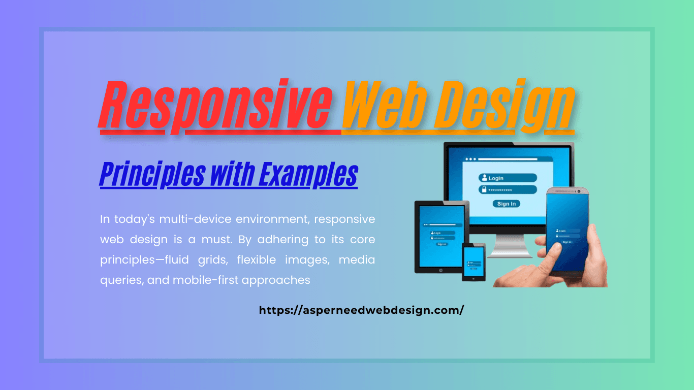
In today’s digital landscape, where users access websites from various devices, responsive web design (RWD) has become a necessity rather than an option. It ensures that websites look and function seamlessly across different screen sizes and devices, enhancing user experience and engagement. This article will delve into the principles of responsive web design and provide practical examples to guide you through implementing these concepts.
What is Responsive Web Design?
Responsive web design is an approach to web development where websites are crafted to adapt to the user’s device and screen size. Instead of creating multiple versions of a website for different devices, RWD uses flexible layouts, media queries, and fluid grids to provide an optimal viewing experience on desktops, tablets, and smartphones.
Principles of Responsive Web Design
- Fluid Grid Layouts:- Relative units, such as percentages, are used in fluid grid layouts rather than fixed units, such as pixels. This approach allows the design elements to resize proportionally, maintaining consistency across different devices.
Example: If a website’s container width is set to 80%, it will occupy 80% of the screen regardless of the screen’s size. This ensures that the layout adjusts smoothly on devices ranging from large monitors to small smartphones. - Flexible Images and Media:- Images and media elements should resize and scale to fit within their containers without distorting or losing quality. This can be achieved by setting the maximum width of images to 100% of their container.
Example:
img {
max-width: 100%;
height: auto;
- }
This ensures that images resize dynamically while maintaining their aspect ratio.
Media Queries Media queries are CSS techniques used to apply different styles based on the device’s screen size and resolution. They act as breakpoints, ensuring the design adapts to various screen sizes.
Example:
@media (max-width: 768px) {
body {
font-size: 14px;
}
- }
In this example, the font size changes to 14px when the screen width is 768px or smaller, making the text more readable on smaller devices.
Mobile-First Design Mobile-first design prioritizes smaller screens and progressively enhances the design for larger screens. This approach ensures a seamless user experience for mobile users, who often constitute a significant portion of web traffic.
Example: Start with basic styles optimized for mobile devices and add more complex styles using media queries for larger screens:
body {
font-size: 16px;
}
@media (min-width: 1024px) {
body {
font-size: 18px;
}
- }
- Viewport Meta Tag The viewport meta tag ensures that web pages display correctly on mobile devices. Without it, pages may appear zoomed out or require horizontal scrolling.
Example:
<meta name=”viewport” content=”width=device-width, initial-scale=1.0″>
This tag sets the width of the viewport to the device’s screen width and establishes a 1:1 scale ratio, ensuring proper scaling on all devices.
Typography and Readability Responsive typography ensures text is legible on all devices. Using relative units like em or rem for font sizes, line heights, and spacing allows for dynamic adjustments based on screen size.
Example:
body {
font-size: 1rem; /* Base font size */
}
@media (min-width: 1024px) {
body {
font-size: 1.2rem;
}
- }
Examples of Responsive Web Design
- Apple– One of the best examples of responsive design is the Apple website. The layout, images, and typography adjust seamlessly across devices, providing an intuitive experience whether you’re on a smartphone or a desktop.
- Airbnb– Airbnb’s responsive design focuses on usability and simplicity. The site’s grid layout and fluid images ensure a consistent experience across all screen sizes.
- Bootstrap Framework– Websites built with the Bootstrap framework inherently follow responsive principles. Bootstrap’s pre-designed components and grid system make it easier to create responsive layouts with minimal effort.
Benefits of Responsive Web Design
- Improved User Experience A responsive website ensures visitors can navigate and interact with your content effortlessly, boosting engagement and reducing bounce rates.
- Cost Efficiency Instead of maintaining separate sites for mobile and desktop users, a single responsive site caters to all devices, saving time and resources.
- SEO Benefits Mobile-friendly websites are given preference by search engines such as Google. A responsive design improves your site’s search engine ranking, driving more organic traffic.
- Faster Page Load Times Responsive design optimizes elements for smaller screens, reducing load times and improving overall performance.
Tools and Frameworks for Responsive Design
- Bootstrap A popular CSS framework that simplifies creating responsive layouts with its pre-designed grid system and components.
- CSS Grid and Flexbox Modern CSS techniques like Grid and Flexbox make it easier to create flexible and adaptive layouts.
- Media Query Debugger Tools like Chrome DevTools allow developers to test and debug responsive designs across various screen sizes.
Conclusion
In today’s multi-device environment, responsive web design is a must. By adhering to its core principles—fluid grids, flexible images, media queries, and mobile-first approaches—you can create websites that provide exceptional user experiences. Whether you’re a beginner or an experienced developer, integrating responsive design into your projects will future-proof your websites and keep them competitive in an ever-evolving digital landscape.

